Interpretable ML — PDP, ALE and SHAP
1. Partial Dependence Plots (PDPs)
Partial Dependence Plots (PDPs) are a tool for interpreting the relationship between a subset of input features and the predictions of a machine learning model.
The key intuition is to isolate the marginal effect of one or more features on the model’s output by averaging out the influence of all other features. Here’s how it works intuitively:
-
Marginalization Over Other Features:
For a chosen feature (or set of features), the PDP shows how the model’s predictions change as the feature varies, while averaging over the observed values of all other features. This effectively “controls” for the other variables, revealing the average behavior of the model with respect to the feature of interest. -
Visualization of Trends:
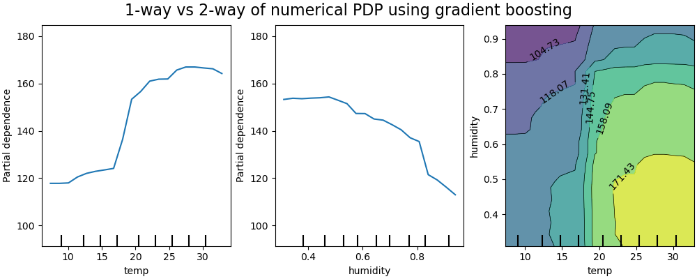
By plotting the average prediction against the feature’s value, PDPs reveal whether the relationship is linear, monotonic, or nonlinear. For example, in a house price prediction model, a PDP for the “number of bedrooms” might show if increasing bedrooms consistently raises prices or if the effect plateaus. -
Handling Interactions (Optional):
PDPs can also be extended to two features to visualize interaction effects (e.g., how “square footage” and “number of bedrooms” jointly affect house prices).
Mathematical Explanation
Formulation of Partial Dependence
Let the model prediction function be denoted as $ f(\mathbf{X}) $ , where $ \mathbf{X} = (X_1, X_2, \dots, X_p) $ is the feature vector. Partition $ \mathbf{X} $ into two subsets:
- $ X_S $ : The features of interest (e.g., $ X_1 $ and $ X_2 $ ).
- $ X_C $ : The complement set of all other features ($ C = \{1, \dots, p\} \setminus S $ ).
The partial dependence function is defined as the expected value of $ f(\mathbf{X}) $ over the marginal distribution of $ X_C $ , conditioned on fixing $ X_S = \mathbf{x}_S $ :
$$ \text{PD}_S(\mathbf{x}_S) = \mathbb{E}_{X_C}\left[ f(\mathbf{x}_S, X_C) \right] = \int f(\mathbf{x}_S, \mathbf{x}_C) \, dP(\mathbf{x}_C), $$ where $ P(\mathbf{x}_C) $ is the marginal distribution of $ X_C $ .
Empirical Approximation
In practice, we approximate the integral using the observed data. For a dataset with $N$ samples, the empirical partial dependence is:
$$ \widehat{\text{PD}}_S(\mathbf{x}_S) = \frac{1}{N} \sum_{i=1}^N f(\mathbf{x}_S, \mathbf{x}_C^{(i)}), $$where $ \mathbf{x}_C^{(i)} $ are the observed values of $ X_C $ for the $ i $ -th instance. For each value of $ \mathbf{x}_S $ , we:
-
Replace $ X_S $ with $ \mathbf{x}_S $ in all instances.
-
Compute predictions $ f(\mathbf{x}_S, \mathbf{x}_C^{(i)}) $ .
-
Average these predictions across all instances.
Key Assumptions and Limitations
-
Independence Assumption:
PDPs assume $ X_S $ and $ X_C $ are independent. If they are correlated (e.g., “bedrooms” and “square footage”), the PDP may extrapolate to unrealistic combinations of features. -
Masking Interactions:
PDPs show average effects, potentially obscuring interactions. For example, if $ X_1 $ has opposite effects on predictions depending on $ X_2 $ , the PDP for $ X_1 $ might show a flat line due to averaging. -
Computational Cost:
Evaluating $ \widehat{\text{PD}}_S $ requires $ N \times \text{(grid size of } \mathbf{x}_S) $ predictions, which can be expensive for large datasets.
Connection to Random Forests
Random Forests are ensembles of decision trees. The PDP for a Random Forest works by:
- Fixing $ X_S = \mathbf{x}_S $ across all trees.
- For each tree, using its structure to compute predictions with $ \mathbf{x}_S $ .
- Averaging predictions across all trees and instances.
Why It Works for Random Forests
- Trees naturally handle mixed data types and nonlinearities, making PDPs effective for visualizing complex relationships.
- The averaging over trees and data instances aligns with the empirical approximation of $ \mathbb{E}_{X_C}[f(\mathbf{x}_S, X_C)] $ .
Example and Visualization
Suppose we train a Random Forest to predict house prices ($ Y $ ) using features $ X_1 $ (square footage) and $ X_2 $ (number of bedrooms). A PDP for $ X_1 $ would:
-
Create a grid of $ X_1 $ values (e.g., 500, 1000, 1500 sq.ft).
-
For each grid value $ x_1 $ :
- Set $ X_1 = x_1 $ for all instances in the dataset.
- Compute predictions using the Random Forest.
- Average predictions across all instances.
-
Plot $ x_1 $ vs. the average prediction.
The resulting curve might show that prices increase with square footage but plateau beyond 2000 sq.ft.
Summary
-
Intuition: PDPs visualize the average effect of a feature on predictions, marginalizing over other features.
-
Mathematics: They approximate $ \mathbb{E}_{X_C}[f(\mathbf{x}_S, X_C)] $ using the empirical distribution of the data.
-
Use Case: Effective for interpreting complex models like Random Forests, but caveats apply (e.g., feature correlations). For interactions, use 2D PDPs or ICE plots.
2. Accumulated Local Effects (ALE) plots
Motivation Behind ALE (relax independence assumption)
Partial Dependence Plots (PDPs) are great for showing average feature effects, but they rely on an independence assumption—averaging over the marginal distribution of other features. This can lead to unrealistic combinations when features are correlated.
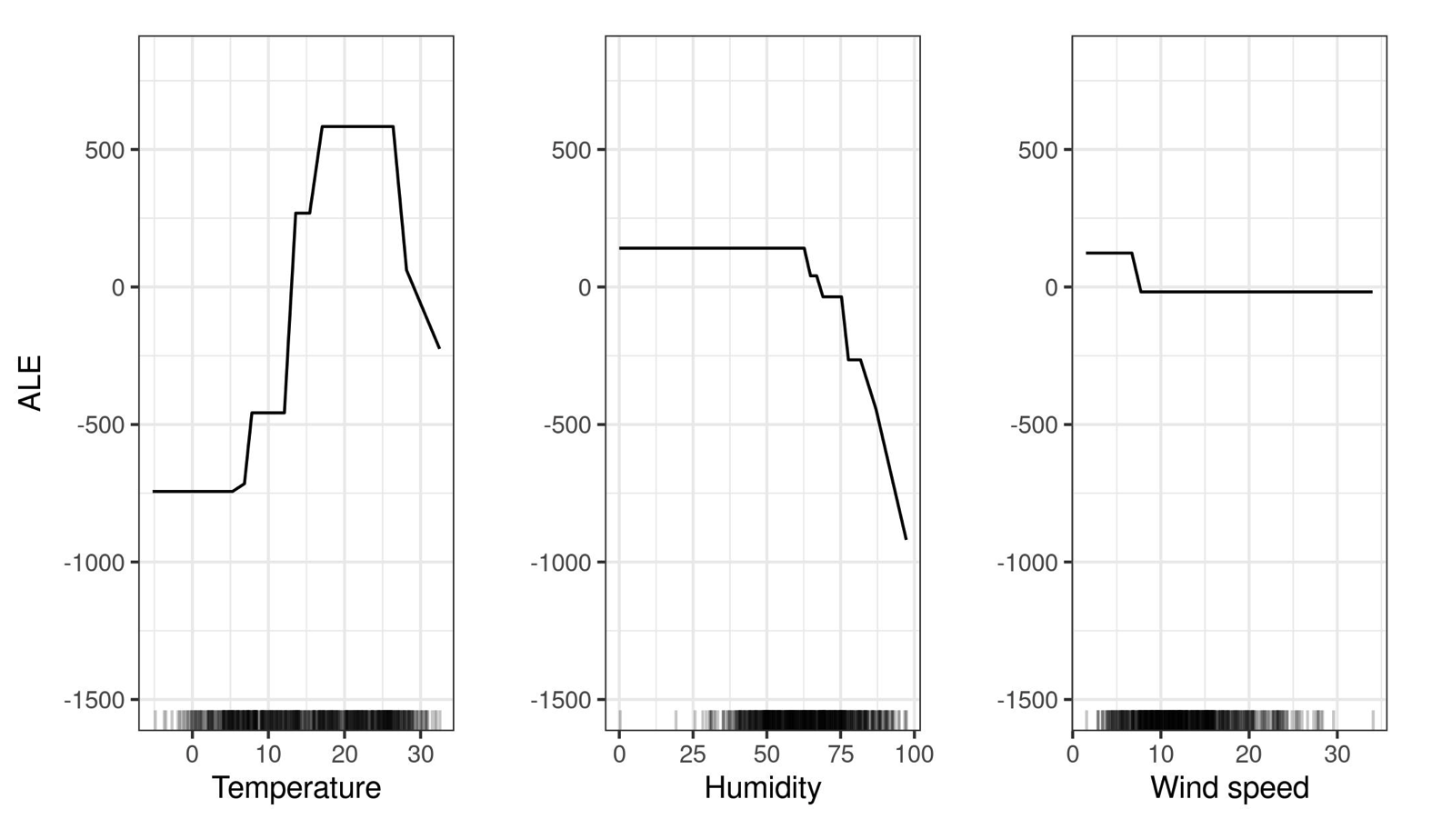
Accumulated Local Effects (ALE) plots are designed to overcome this limitation. Instead of averaging over all observations globally, ALE focuses on differences in predictions to isolate each feature’s effect.
-
Compute Local Derivatives: They first estimate the local effect (i.e., the derivative) of the feature on the model prediction in small intervals (bins) of the feature’s range.
-
Accumulate the Effects: Then they integrate (accumulate) these local effects over the feature’s range, starting from a reference point (often the minimum value).
-
Centering: Finally, the accumulated effect is centered so that the overall average effect is zero, making it easier to compare across features.
This method only relies on differences between nearby observations—where the joint distribution is supported—thus avoiding unrealistic extrapolations.
Mathematical Explanation
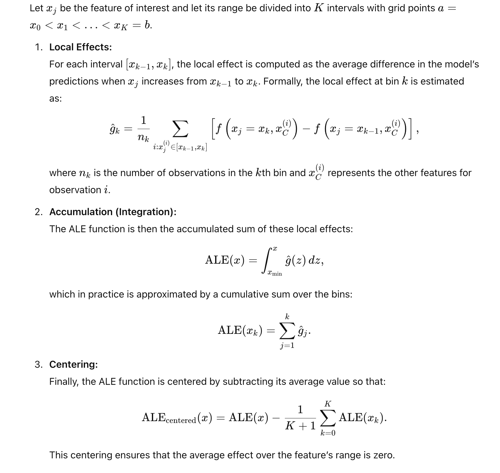
Naive summary of computation steps for ALE plots:
Divide the Feature Range:
- Split the feature’s values into intervals (bins).
Calculate Local Differences:
- Within each bin, for each instance, compute the change in the model’s prediction when the feature’s value is replaced with the bin’s upper and lower boundaries.
- Average these differences within the bin to determine the feature’s local effect.
Accumulate Effects:
- Sum these local effects across the bins to visualize the feature’s overall impact on the model’s predictions.
By focusing on prediction differences, ALE plots effectively account for feature correlations, providing a clearer understanding of each feature’s true effect on the outcome.
Interpretation
“The value of the ALE can be interpreted as the main effect of the feature at a certain value compared to the average prediction of the data. For example, an ALE estimate of -2 at $x_j=3$ means that when the j-th feature has value 3, then the prediction is lower by 2 compared to the average prediction.” – IML textbook
3. SHAP Values
Intuition:
SHAP (SHapley Additive exPlanations) values attribute the difference between a model’s prediction for an instance and the average prediction to each feature. Inspired by cooperative game theory (Shapley values), SHAP fairly distributes the “contribution” of each feature to the prediction.
Key Properties:
- Additivity: The sum of SHAP values for all features equals the difference between the prediction and the baseline (average prediction).
- Local Accuracy: Each feature’s contribution is computed for a single instance.
- Consistency: If a feature’s impact increases, its SHAP value won’t decrease.
Mathematical Formulation:
For a model $f$, the SHAP value $\phi_i$ for feature $i$ is:
$$ \phi_i = \sum_{S \subseteq F \setminus {i}} \frac{|S|! (|F| - |S| - 1)!}{|F|!} \left[ f(S \cup {i}) - f(S) \right] $$
- $F$: Set of all features.
- $S$: Subset of features excluding $i$.
- $f(S)$: Expected prediction when only features in $S$ are known.
Interpretation:
- $\phi_i > 0$: Feature $i$ increases the prediction.
- $\phi_i < 0$: Feature $i$ decreases the prediction.
4. ALE vs. SHAP: When to Use Which?
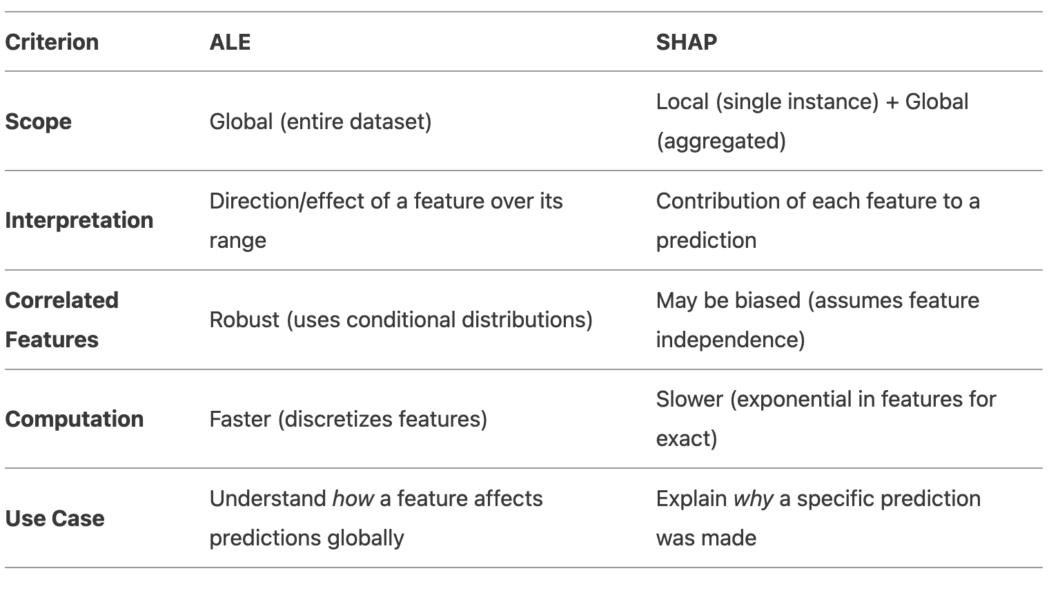
When to Use ALE:
- You care about global feature effects (e.g., “Does income positively affect loan approval?”).
- Features are correlated, and you want reliable estimates.
- You need a clear visual of the feature’s directional trend.
When to Use SHAP:
- You need instance-level explanations (e.g., “Why was this loan rejected?”).
- You want to compare feature importance across the dataset (aggregated SHAP).
- Your model has nonlinear interactions best captured per-instance.
Final Recommendation
- Use ALE if your goal is to understand the overall directional relationship between a feature and the outcome, especially with correlated features.
- Use SHAP if you need to explain individual predictions or compare feature importance globally.
For example:
- A bank might use ALE to audit whether income has a fair directional effect on loan approvals.
- The same bank could use SHAP to explain to a customer why their specific loan application was denied.
R packages 📦
Here are some R packages to implement:
- pdp: Partial Dependence Plots
- vivid: Variable Importance and Variable Interaction Displays
- iml: Interpretable Machine Learning
- DALEX: moDel Agnostic Language for Exploration and eXplanation
References
More theory behind ALE plot, check this paper: Apley, D. W., & Zhu, J. (2020). Visualizing the effects of predictor variables in black box supervised learning models. Journal of the Royal Statistical Society Series B: Statistical Methodology, 82(4), 1059-1086.
“8.1 Partial Dependence Plot (PDP)” in IML textbook by Christoph Molnar
“8.2 Accumulated Local Effects (ALE) Plot” in IML textbook
Interpretable Machine Learning (IML) – online tutorial
scikit-learn tutorial: 4.1. Partial Dependence and Individual Conditional Expectation plots