R Plotly Tutorial
$$
\newcommand{\indep}{\mathrel{\perp\mkern-10mu\perp}}
\newcommand{\P}{\mathbb{P}}
\newcommand{\R}{\mathbb{R}}
\newcommand{\E}{\mathbb{E}}
\newcommand{\Var}{\operatorname{Var}}
\newcommand{\Cov}{\operatorname{Cov}}
\newcommand{\1}[1]{\mathbf{1}\\{#1\\}}
$$
Convert to plotly object using

Loading Package
library(tidyverse)
library(plotly)
library(zetaEDA)
enable_zeta_ggplot_theme()
ggplotly
If you are very familiar with ggplot, then you can easily convert the ggplot object to plotly object, which is able to interactively communicate the plots with the end-user.
set.seed(123)

dat <- tibble(
  date = seq.Date(from = as.Date("2010-01-01"), length.out = 48, by = "month"),
  actual = rnorm(48, mean = 10, sd = 3),
  fc = rnorm(48, mean = 9.8, sd = 2.4)
)

dat <- dat %>%
  mutate(
    diff = actual - fc,
    RMSE = sqrt(mean((diff)^2)),
    MAE = mean(abs(diff))
  )
Take a look at our data:
dat %>%
  head() %>%
  knitr::kable()
| date | actual | fc | diff | RMSE | MAE |
|---|---|---|---|---|---|
| 2010-01-01 | 8.318573 | 11.671916 | -3.3533432 | 3.462068 | 2.836012 |
| 2010-02-01 | 9.309468 | 9.599914 | -0.2904467 | 3.462068 | 2.836012 |
| 2010-03-01 | 14.676125 | 10.407964 | 4.2681605 | 3.462068 | 2.836012 |
| 2010-04-01 | 10.211525 | 9.731488 | 0.4800374 | 3.462068 | 2.836012 |
| 2010-05-01 | 10.387863 | 9.697111 | 0.6907523 | 3.462068 | 2.836012 |
| 2010-06-01 | 15.145195 | 13.084646 | 2.0605495 | 3.462068 | 2.836012 |
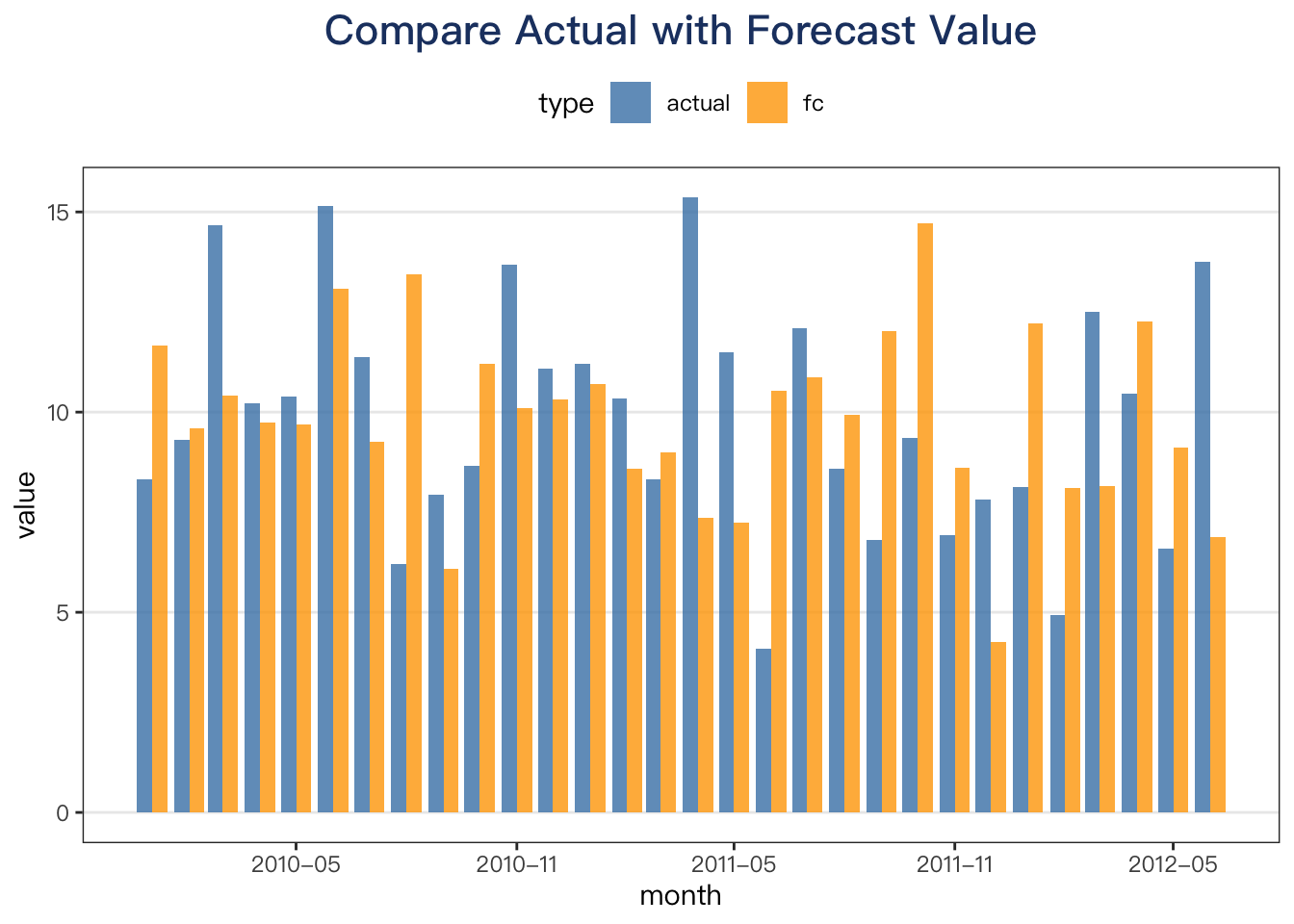
ggplot code
plt_dat <- dat %>%
  select(actual, fc, date) %>%
  pivot_longer(cols = -date, names_to = "type", values_to = "value") %>%
  mutate(type = factor(type, levels = c("actual", "fc"))) %>%
  filter(date <= as.Date("2012-06-01"))

p <- plt_dat %>%
  ggplot(aes(x = date, y = value, fill = type)) +
  geom_col(position = "dodge", alpha = .8) +
  scale_fill_manual(values = c("steelblue", "orange")) +
  scale_x_date(
    date_breaks = "6 month",
    date_labels = "%Y-%m"
  ) +
  labs(x = "month", y = "value", title = "Compare Actual with Forecast Value")

p
Convert to plotly object using ggplotly
When you have a ggplot object, you can apply ggplotly function directly to get the result.
Note that:
-
This approach is the easiest way to do conversion!
-
However, this approach lacks some customization for plotly object.
# ?ggplotly

ggplotly(p)
Plotly
For advanced usage, please use plotly pacakge function directly!
Reference: plotly r offical website
Quickly learn use cheat sheet for plotly.
# step 1: make a plotly object
p2 <- plot_ly()

# step 2: add trace
p2 <- p2 %>%
  plotly::add_trace(
    data = plt_dat,
    x = ~date,
    y = ~value,
    color = ~type,
    type = "bar",
    colors = c("steelblue", "orange"),
    text = ~date,
    hovertemplate = "%{text}<br>%{y:.2f}"
  )

# step 3: set layout, i.e. x-axis, y-axis, title, etc.
p2 <- p2 %>%
  plotly::layout(
    title = "Compare Actual with Forecast Value",
    xaxis = list(
      tickformat = "%m\n%Y\n",
      title = "month",
      showline = TRUE,
      mirror = TRUE
    ),
    yaxis = list(
      showline = TRUE,
      mirror = TRUE,
      title = "value"
    )
  )
print your plotly object :)
p2